Designing the Perfect Home Theater
The big movie houses are fighting a losing battle. Every year they talk about losing money at
the box office, they complain that people are going out to the movies less
often than they used to, and their response to losing money is to raise the
prices of their tickets and concessions.
The natural response of course is to make your movie night one you have
at home. The floors aren’t sticky, the
snacks are cheaper, and any screaming baby or annoying cell phone noises are
yours to deal with as you please.
With HD televisions, Blu-ray players, and surround sound
systems widely available and at affordable prices, the tech is certainly there
to create an amazing home theater experience.
Our focus here will be to look at the aesthetics of home theater design
and offer design ideas that may help you design your ideal environment.
Here we have a wonderfully cluttered home theater. This person takes a design approach akin to
throwing wet pasta at a wall to see what sticks. The presence of a dog adds a nice lived in
touch and the nearby cola fridge can provide quick refreshment in a time of
need. The problems with this layout come
from what is in proximity to the screen.
The bright color of the nearby fridge can be distracting to the eye and
the media shelf also detracts from the viewing experience. A high shelf that is occupied draws the eye
away.
Consider this: in home design there are basically two
approaches to a room, fashion or function.
If the function of your home theater is to comfortable sit and enjoy a
movie then your focus should be on the screen and not drawn to other objects in
the room.
Consider the dimensions of your room when you are designing
a home theater. You can take one of two
approaches, design the room around your television or get a television that
matches the room. Sitting far away from
a tiny screen means straining to see what’s going on while being too close can
give your eyes screen overload.
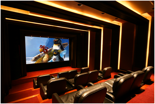
Our next example is a
stellar one indeed. The aesthetic design
is very pleasing. This home theater uses
the concept of stadium seating with ample spacing to allow for an incredibly
comfortable seating arrangement.
The darkened tones of the color scheme also reduce any
reflective wash that occurs when watching a movie. The seats in the front row even allow for one
to take up a more relaxed approach in their movie viewing. The size of the screen is adequate for the
size of the room creating a comfortable viewing experience wherever you sit.
The only complaint to
address would be the lights in the room.
Imagine staring at a screen for the two to three hours it takes to watch
a movie and staring both at a screen and a bright light placed adjacent to
it. The corner of your eye is going to
have flash burn after that long. Dimmer
switches are great for the lights in a home theater allowing you to adjust and
still get that theater feel.
The placement of lighting is important in a home theater much like it is in any other room. Your
movie screen is the focus of your room and ideally you don’t want any other
light source overwhelming it. Recessed
ceiling lighting or track
lighting is a great choice for lighting a home theater. The light sources are well above eye-level
and line of sight or can be directed to where they need to be.
This is closely approaching an ideal aesthetic design for a
home theater. Recessed ceiling lights, a
dark room palette, a sizeable screen, stadium seating, and double seats in the
middle of each row for one that enjoys watching movies on their sides. The position of a lighting rig over the screen
may be a bit of a distraction to the viewing experience but a simple dimmer
switch can help you adjust the lights to an ideal setting.
The perfect home theater is actually quite subjective. It really is up to you as a person how you
design a room. Consider the aesthetics
of a home theater and remember that it ideally should be a room that accents
the function over fashion. Make it truly
yours and you’ll find yourself having trouble remembering why you ever left
your house to go to the cinemas.
Ross Donald
is a freelance writer and interior design specialist with the light fixtures provider
LightingSale.com. Ross loves working
with clients to design their ideal setting and enjoys the smiles on peoples’
faces when they can fully relax in their own homes.
XYBJ7DV8DEJG
XYBJ7DV8DEJG


No comments
Note: only a member of this blog may post a comment.